
Reading news stories about Tesla feels like watching reality TV. Broken windows, lawsuits, and funny dancing are common to both.
And just like reality TV affects those who are invested in the show (I’m looking at you, The Bachelorette fans), Tesla news stories affect those who have invested in the stock. Intuitively, the stock seems to have been extremely volatile over 2019. In this post I set out to determine whether or not that is actuallly true by using stock data to compare Tesla’s volatility to other major car companies.
I will do this using one of my favorite tools for analyzing data, the R programming language.
Let’s begin by covering some background information on volatility. Then we will move on to the analysis in R.
Analyzing Volatility
How can we analyze volatility for a given company? One way is to plot the percent change in share price for each day in 2019. Here is a formula for the percent change on the nth day of the year, pn,
where cn is the closing price for the nth day of the year.
For example, if a company has a closing price of $100.00 on January 10th, and a closing price of $105.00 on January 11th, then the percent change for January 11th is ((105.00 - 100.00)/100.00)*100 = 5%
Once we have computed the percent change for each day in 2019, we can display this on a plot. Here is an example of how such a plot might look,
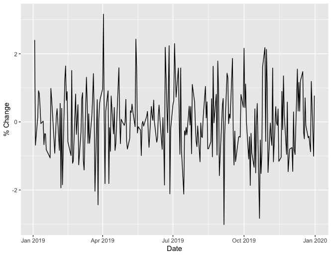
Loosely speaking, a flatter plot means lower volatility. This means we can compare the volatility of two companies by comparing their plots. Here is an example of such a comparison using simulated data for companies A and B,
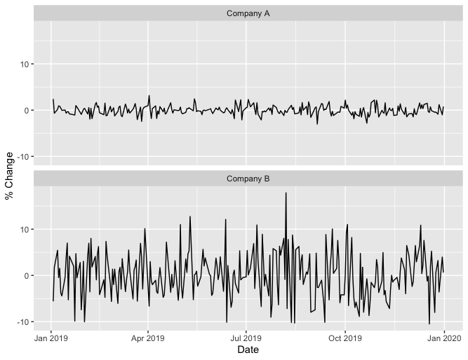
From these plots we see that company B stock was more volatile in 2019 than company A.
Another way to measure volatility is by computing the standard deviation of these percent changes. A larger standard deviation corresponds to higher volatility. Using the same simulated data for company A and company B, company A has a standard deviation of 0.97, while company B has a standard deviation of 5.26, again indicating that company B had higher volatility.
Now let’s use these two methods to compare the volatility of Tesla stock to other car companies in 2019. In particular, we will compare Tesla to Ford, General Motors, Honda, Toyota, Daimler, and Nissan.
Volatility Comparison in R
First, we need to load all of the packages we will use for our analysis.
Step 1 - Load packages
library(quantmod)
library(stringr)
library(tidyr)
library(dplyr)
library(ggplot2)
We will use quantmod for retrieving financial data, stringr for string operations, tidyr and dplyr for data manipulation, and ggplot2 for plotting.
Now we need to get Tesla stock price data.
Step 2 - Get Tesla stock price data
tesla_data <- getSymbols("TSLA", auto.assign = FALSE)
This is easy to do with the getSymbols function from the quantmod package. We pass in our ticker symbol, “TSLA”, and this function retrieves the data from Yahoo! Finance.
Let’s see how the first 6 rows and the last 6 rows of data look,
head(tesla_data)
           TSLA.Open TSLA.High TSLA.Low TSLA.Close TSLA.Volume TSLA.Adjusted
2010-06-29     19.00     25.00    17.54      23.89    18766300         23.89
2010-06-30     25.79     30.42    23.30      23.83    17187100         23.83
2010-07-01     25.00     25.92    20.27      21.96     8218800         21.96
2010-07-02     23.00     23.10    18.71      19.20     5139800         19.20
2010-07-06     20.00     20.00    15.83      16.11     6866900         16.11
2010-07-07     16.40     16.63    14.98      15.80     6921700         15.80
tail(tesla_data)
           TSLA.Open TSLA.High TSLA.Low TSLA.Close TSLA.Volume TSLA.Adjusted
2020-01-24    570.63    573.86   554.26     564.82    14353600        564.82
2020-01-27    541.99    564.44   539.28     558.02    13608100        558.02
2020-01-28    568.49    576.81   558.08     566.90    11788500        566.90
2020-01-29    575.69    589.80   567.43     580.99    17801500        580.99
2020-01-30    632.42    650.88   618.00     640.81    29005700        640.81
2020-01-31    640.00    653.00   632.52     650.57    15670600        650.57
We see that we have stock price data for dates between June 29th, 2010 (the first day Tesla stock was available to the public) and January 31st, 2020 (the day prior to the date this post was written). We only want the prices for 2019,
tesla_2019_data <- tesla_data["2019"]
tesla_data may look like a dataframe, but it is actually an object of class “xts”, which is why we can use the convenient filtering operation above.
Also, we only want closing prices,
combined_2019_data <- tesla_2019_data[, "TSLA.Close"]
We select just the closing prices and store them in a new variable called combined_2019_data. We named this variable combined_2019_data because we are now going to add data from our other car companies.
Step 3 - Get stock prices for other car companies
symbols <- c("F", "GM", "HMC", "TM", "DDAIF", "NSANY")
for (symbol in symbols) {
  symbol_data <- getSymbols(symbol, auto.assign = FALSE)
  close_column <- paste(symbol, ".Close", sep = "")
  symbol_2019_data <- symbol_data["2019", close_column]
  combined_2019_data <- merge(combined_2019_data, symbol_2019_data, join = "left")
}
In the first line, we create a vector containing the ticker symbol for each of our comparison companies. Then we loop over this vector and retrieve the data for each company in the same manner that we retrieved data for Tesla. With each iteration, we append the new data using the merge function.
Let’s see how this data looks,
head(combined_2019_data)
           TSLA.Close F.Close GM.Close HMC.Close TM.Close DDAIF.Close NSANY.Close
2019-01-02     310.12    7.90    33.64     26.48   116.28       51.96       16.08
2019-01-03     300.36    7.78    32.25     26.12   114.65       51.11       16.06
2019-01-04     317.69    8.08    33.33     27.31   119.73       53.89       16.36
2019-01-07     334.96    8.29    34.36     27.82   121.28       54.35       16.53
2019-01-08     335.35    8.37    34.81     28.48   122.31       54.72       16.51
2019-01-09     338.53    8.72    35.18     28.70   122.92       56.55       16.54
We see that we have daily closing prices for each company. This is the data we need to compute daily percent changes, but before we do that computation, let’s take care of some small changes to the format of our data.
Step 4 - Re-format the data
combined_2019_df <- data.frame(combined_2019_data)
combined_2019_df <- tibble::rownames_to_column(combined_2019_df, "Date")
combined_2019_df$Date <- as.Date(combined_2019_df$Date, format = "%Y-%m-%d")
We convert our data to a dataframe, and then we convert our dates from row names to an actual column. This is necessary since we will treat our dates as a variable (e.g., when plotting price changes as a function of the date).
Now we are ready to compute the daily percent changes for each company.
Step 5 - Compute daily percent changes
for (col in names(combined_2019_df)[-1]) {
  symbol <- str_sub(col, 1, -7)
  new_col_name <- paste(symbol, "% Change")
  col_values <- combined_2019_df[[col]]
  combined_2019_df[[new_col_name]] <- 100*(col_values - lag(col_values))/lag(col_values)
}
We use a for loop to iterate over the closing price columns. Within each iteration, we create the name for the new column (e.g, “TM % Change” for Toyota), calculate the percent changes, and assign these percent changes to the new column. Line five is particularly interesting, as it shows how we can express our formula for the percent change concisely in R. This brevity is made possible by the lag function, which shifts each value in a vector down by one, and the fact that arithmetic operations are vectorized in R.
Let’s take a look at the first 6 rows of our data now,
head(combined_2019_df)
        Date TSLA.Close F.Close GM.Close HMC.Close TM.Close DDAIF.Close NSANY.Close TSLA % Change F % Change GM % Change HMC % Change TM % Change DDAIF % Change NSANY % Change
1 2019-01-02     310.12    7.90    33.64     26.48   116.28       51.96       16.08            NA         NA          NA           NA          NA             NA             NA
2 2019-01-03     300.36    7.78    32.25     26.12   114.65       51.11       16.06    -3.1471721 -1.5189873   -4.131983   -1.3595128  -1.4017862     -1.6358699     -0.1243843
3 2019-01-04     317.69    8.08    33.33     27.31   119.73       53.89       16.36     5.7697489  3.8560411    3.348843    4.5558880   4.4308774      5.4392447      1.8680076
4 2019-01-07     334.96    8.29    34.36     27.82   121.28       54.35       16.53     5.4361135  2.5990099    3.090306    1.8674516   1.2945761      0.8535888      1.0391197
5 2019-01-08     335.35    8.37    34.81     28.48   122.31       54.72       16.51     0.1164363  0.9650181    1.309662    2.3723940   0.8492736      0.6807783     -0.1209982
6 2019-01-09     338.53    8.72    35.18     28.70   122.92       56.55       16.54     0.9482609  4.1816010    1.062910    0.7724754   0.4987327      3.3442945      0.1817141
We can see that there are NA values for the percent changes on January 2nd. This is because January 2nd is the first day for which we have closing price data (January 1st is not included because it is a holiday). Since it is the first day, a percent change using the prior day’s closing price cannot be computed, resulting in the NA’s. This is expected, and we can remove it from our dataset,
combined_2019_df <- combined_2019_df[-1, ]
Now we are ready to do some data manipulation to get our data into a format that is suitable for plotting.
Step 6 - Data manipulation
combined_2019_df <- select(combined_2019_df, Date, `TSLA % Change`:`NSANY % Change`)
names(combined_2019_df)[-1] <- str_sub(names(combined_2019_df)[-1], 1, -10)
combined_2019_df <- gather(combined_2019_df, key = "Symbol", value = "% Change", TSLA:NSANY)
We select the percent change columns, filtering out the closing price columns that are no longer needed. Then we remove “% Change” from our column names, leaving just the company ticker symbol for each column. In the third line we re-format the data so that the company is represented as a variable (rather than having a separate column for each company).
For example, when we run the code below,
filter(combined_2019_df, Date == "2019-01-03")
We get this result,
        Date Symbol   % Change
1 2019-01-03   TSLA -3.1471721
2 2019-01-03      F -1.5189873
3 2019-01-03     GM -4.1319829
4 2019-01-03    HMC -1.3595128
5 2019-01-03     TM -1.4017862
6 2019-01-03  DDAIF -1.6358699
7 2019-01-03  NSANY -0.1243843
Whereas if we had run that code before the re-formatting, we would have gotten,
        Date      TSLA         F        GM       HMC        TM    DDAIF      NSANY
1 2019-01-03 -3.147172 -1.518987 -4.131983 -1.359513 -1.401786 -1.63587 -0.1243843
We want the data in the new format (where the companies are represented by a variable) because this will allow us to easily make plots for comparison using the ggplot2 package.
Step 7 - Plot the data
ggplot(data = combined_2019_df) +
  geom_line(aes(x = Date, y = `% Change`)) +
  facet_wrap("Symbol", nrow  = 2) +
  scale_x_date(date_labels = "%b")
We tell ggplot that we want to use the combined_2019_df dataset for our plot. We then indicate what type of plot we want (geom_line indicates a line plot). We also map our variables “Date” and “% Change” to the x and y coordinates, respectively. In the third line we use facet_wrap to create separate plots for each company (using the variable “Symbol”). This is why we re-formatted the data in step 6; with facet_wrap we can easily create separate plots, where each plot corresponds to a set of observations that have the same value within a specified column. Lastly, we specify that we want the x-axis labels to be three-letter abbreviations for the month.
Here is the resulting plot,
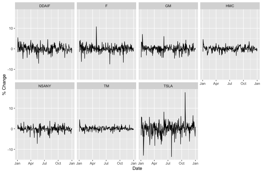
From this plot we see visual evidence that Tesla stock (TSLA) was more volatile in 2019 than Daimler (DDAIF), Ford (F), General Motors (GM), Honda (HMC), Nissan (NSANY), and Toyota (TM). Let’s see if our second method of comparing volatilities agrees with this.
Step 8 - Compute the standard deviation of the percent changes
combined_2019_df %>%
  group_by(Symbol) %>%
  summarize(`Standard Deviation of % Change` = sd(`% Change`)) %>%
  arrange(desc(`Standard Deviation of % Change`))
We group the data by company, and then we apply the standard deviation calcluation to each group. We then order the data so that the companies with the highest standard deviation will be listed at the top.
Here is the result,
  Symbol `Standard Deviation of % Change`
  <chr>                             <dbl>
1 TSLA                              3.08
2 F                                 1.72
3 DDAIF                             1.72
4 GM                                1.55
5 NSANY                             1.34
6 HMC                               1.14
7 TM                                0.852
We see that Tesla had the highest standard deviation, again indicating that Tesla had higher volatility than these other car companies during 2019.
Conclusion
We have shown that Tesla had higher volatility than other car companies in 2019 using R. I’d like to thank the creators of the R packages that make this analysis so easy. I’d also like to thank the creators of the Cybertruck, for making windows that are shatter-proof, but maybe not that shatter-proof. Your contributions to this dataset are applauded.
About the Author
Jon Chapman is a consultant at Source Allies who specializes in Data Analytics. When not using data to poke fun at Cybertrucks, he enjoys trail running, hiking, and listening to music.
R References
To learn more about R and the packages that were used in this post, see the links below,
About R
quantmod Package
stringr Package
tidyr Package
dplyr Package
ggplot2 Package
The full R script that was used for this post is available on GitHub.