
Every year the Women in Data Science initiative (WiDS) provides a datathon open to teams with an interest in data science regardless of experience. WiDS defines a datathon as a “data-focused hackathon — given a dataset and a limited amount of time, participants are challenged to use their creativity and data science skills to build, test, and explore solutions.”
The datathon was established to encourage women to hone their data science skills through a predictive analytics challenge focused on social impact, bringing people together across borders to work in teams, and solving global challenges.
This year, the datathon focused on patient health. The proposed challenge was to create a model predicting patient mortality in the ICU using data from the previous 24 hours. The data provided encompassed 130,000+ visits at 200+ hospitals globally over the course of a year.
Our Toolbox
- The data sets were provided for us on Kaggle. Our models were also submitted via Kaggle.
- We used Google drive to take notes and store our models and data.
- We used Google Collaboratory (Google’s version of Jupyter Notebooks) to import, clean, and process data, and generate models.
- We used python as our language of choice when exploring the data and creating models.
- Slack for communicating and updating on progress in between weekly meetings as a team
The Data
We started off by looking at the data provided by WiDS via Kaggle. Data from over 130,000 hospital visits sounds like a lot of data and it was. We were provided with 91,713 rows of labeled data, where the hospital_death (outcome that hospital stay resulted in mortality) column was given, and 39,308 of unlabeled data, which did not contain hospital_death.
Below is a small snapshot of our dataset. As you can see, some features were very well labeled, such as elective_surgery and others had missing values, like age. This view shows a fun feature of viewing the data set within Kaggle, providing a first glance at what our dataset looked like.
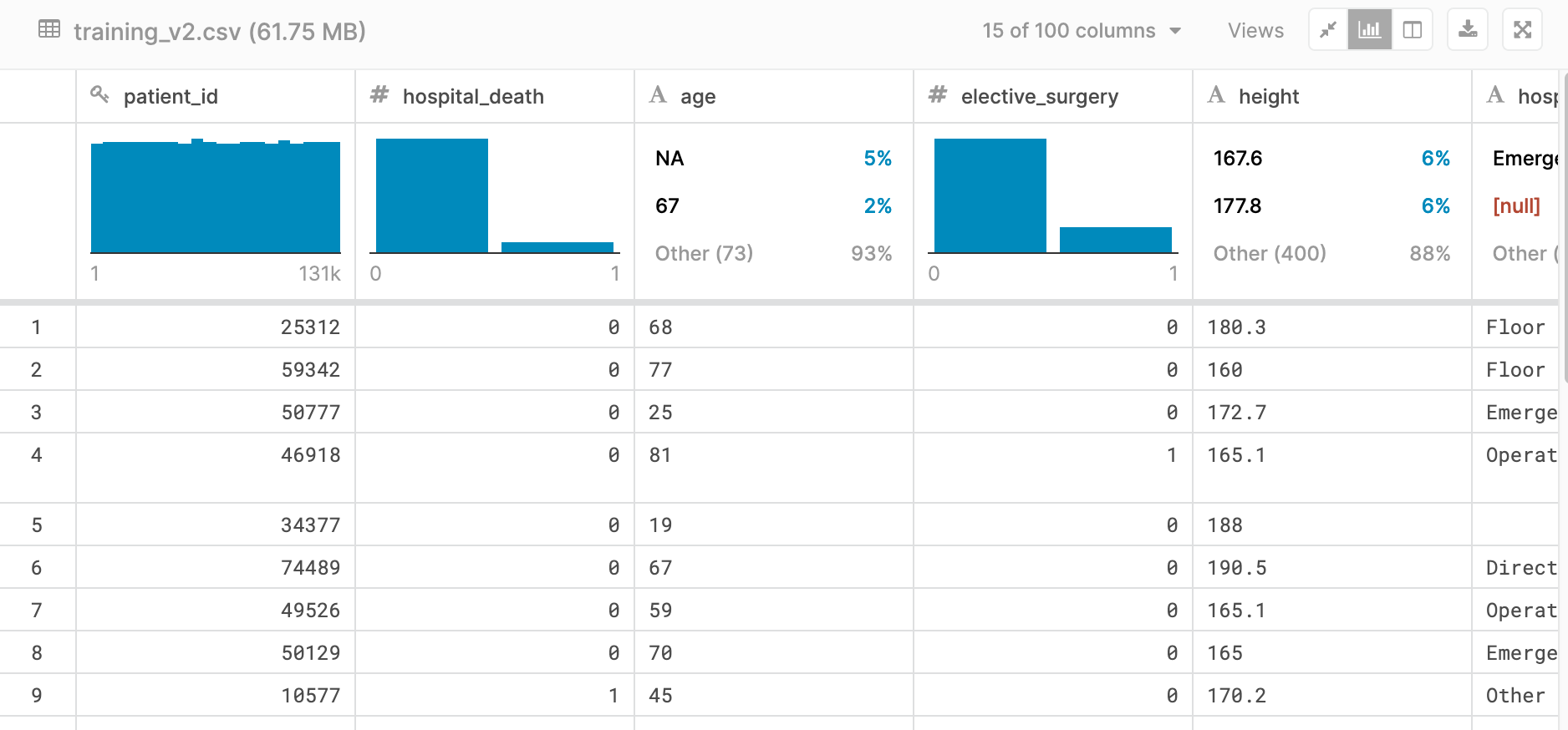
Each row contained roughly 170 features (columns) containing data that ranged from basic vital signs like blood pressure or pulse rate, to the results of complex algorithms such as APACHE IV or GOSSIS.
Between the data dictionary provided by WiDS, many google searches, and explanations by our friends with medical backgrounds, we were able to gain a basic understanding of what the data represented.
Data Preprocessing
An important step in data analysis is processing the data. Not all features in a data set may need to be used in your model. To start, we looked at what data we could safely ignore. The IDs were the first feature columns that could be dropped. There were no recurring patient visits, so the patient_id and encounter_id would not be relevant to our models. Additionally, there was little overlap between the hospitals in the labelled dataset and the hospitals in the unlabelled dataset, so hospital_id would not be useful for building a model that makes predictions on the unlabelled data.
Feature Selection
Next we performed feature selection. Depending on your model, your dataset may contain too many features for it to handle. We decided to take a closer look at what features were more important in predicting a hospital death and used a threshold to eliminate some of our features.
While holding on to all features can help you create a more complex model and perhaps garner additional insights, removing features can also help keep your model from overfitting by relying on too many variables in its prediction.
We used random forests on the training data set to find important features. In addition to holding on to those features with higher importance, we also removed highly correlated features from our data set. This allowed us to remove bias from favoring certain features over others in our models, creating a model that is more performant and better at not overfitting.
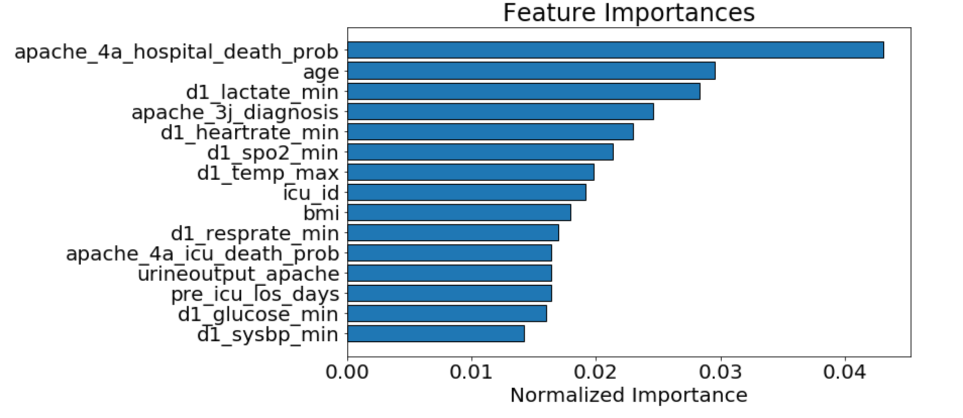
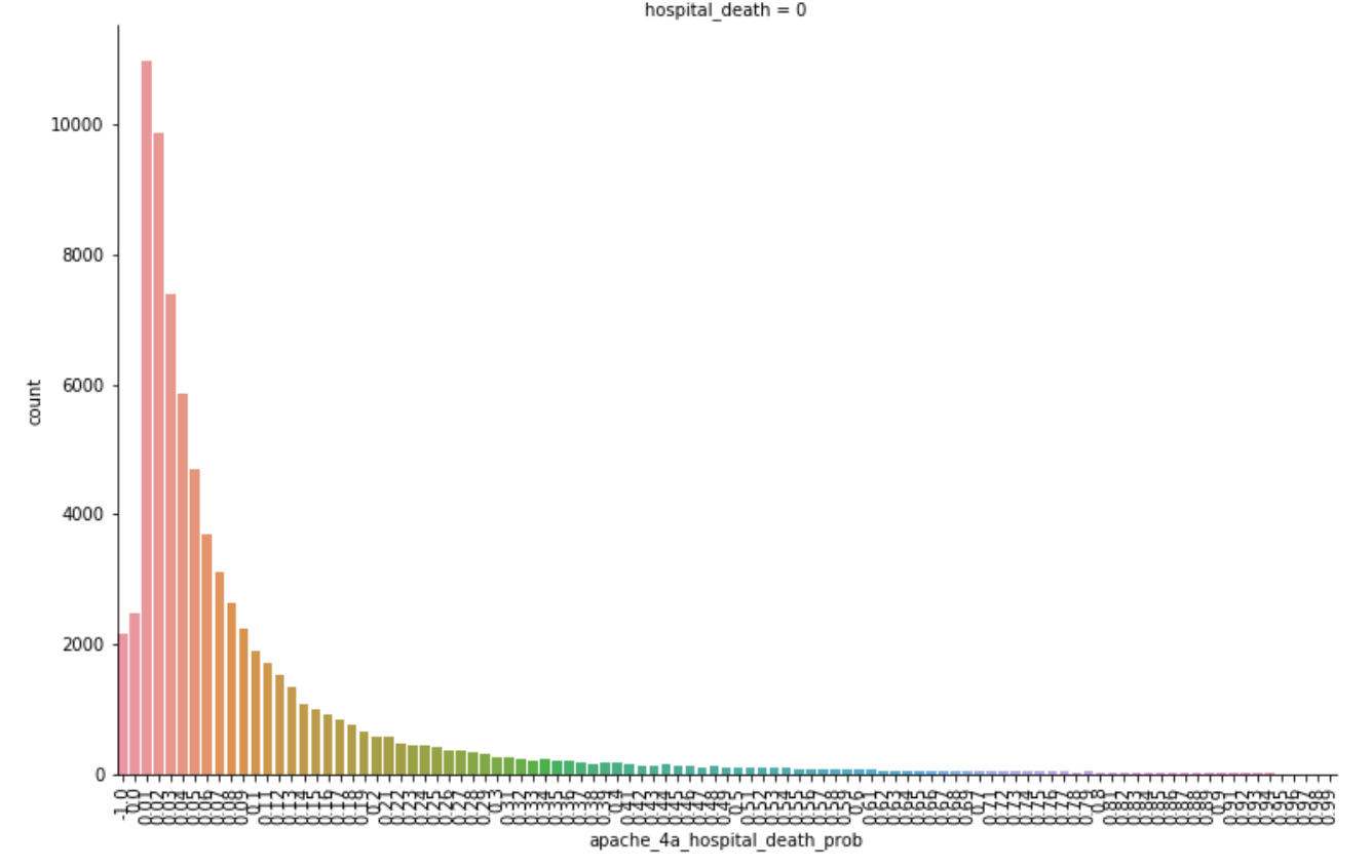
As seen above, we determined that the APACHE_IV hospital death probability was an important feature we could focus on. This was not surprising as it is what is currently used by hospitals in the United States to predict the likelihood of patients dying during their stay. The graph below shows that those with lower apache_4a_hospital_death_prob scores were also more likely to not die in the hospital. You will notice some higher counts for apache_4a_hospital_death_prob scores of -1. The -1 indicates that the apache IV score is missing, we treated these as null values.
Dealing with Missing Data
An unfortunate reality of data sets are missing data points. Our solution required all rows to have a hospital_death prediction, so we needed to deal with these missing values rather than deleting the rows.
The easiest way to deal with a missing value is to replace it with an average of all the other values in a feature. A more complex method is to use imputation - creating models from other features to predict what the value should be. We chose to keep things simple and fill blank values with averages for most of the models discussed below.
The Models
The WiDS Datathon used Area Under the Receiver Operating Characteristic (ROC) curve (AUC) as its evaluation metric. The closer the AUC is to 1, the better. An AUC of 0.9 is much better than an AUC of 0.01.
The Baseline Model
For our first model, we assumed a 0% mortality rate. This was primarily to establish the pipeline from Google Drive to submission via Kaggle. This model yielded an AUC of 0.50.
Gaussian Naive Bayes Model
Next, we used scikit-learn to create a Gaussian Naive Bayes model. This model assumes that each feature will follow a normal distribution, and input any missing data according to the distribution. We ran this algorithm against the training set then used it to make predictions on the test data. This model yielded an AUC of 0.70854.
Light Gradient Boosting Machine Model
The remainder of our submitted models used the Light Gradient Boosting Machine (LGBM) Model. LGBM is a Gradient Boosting Framework built by Microsoft and designed to be distributed and efficient. It uses decision trees to iterate over the data with a set of learning algorithms to obtain the best predictive model. This model yielded an AUC of up to 0.90 on the test data set.
The Lessons Learned
While model making is often the “cool” part of data science, we really only spent 10% of our time here. The other 90% of our time was spent understanding and grooming the data set.
Understanding the data is vital to the process. The data will determine the model, the feature selection and the data imputation method. The first place team in the datathon attributed their success partially to having a medical expert on their team.
There’s never enough time to do all you want to do with a given data set. While we ran out of time, we understood the importance of ensemble methods and realized our model would benefit from this if given more time.
Data science is a team sport.
Meredith Lee, Executive Director at West Big Data Innovation Hub
Conclusion
We finished in 645th place (out of 951 teams) with an AUC of 0.90081. While this doesn’t seem terribly great, only 0.01416 separated us from the 1st place team. That said, a lot of work goes into getting that extra 0.014 AUC and it is not to be undermined.
We all thoroughly enjoyed our first Kaggle competition and the opportunity to get our hands on a real-world data set outside of our comfort zone. For some of us, this was a great first experience with data science. For others, it was an opportunity to try out new models. All of us appreciated the opportunity to collaborate with teammates we don’t work with every day and learn along the way.